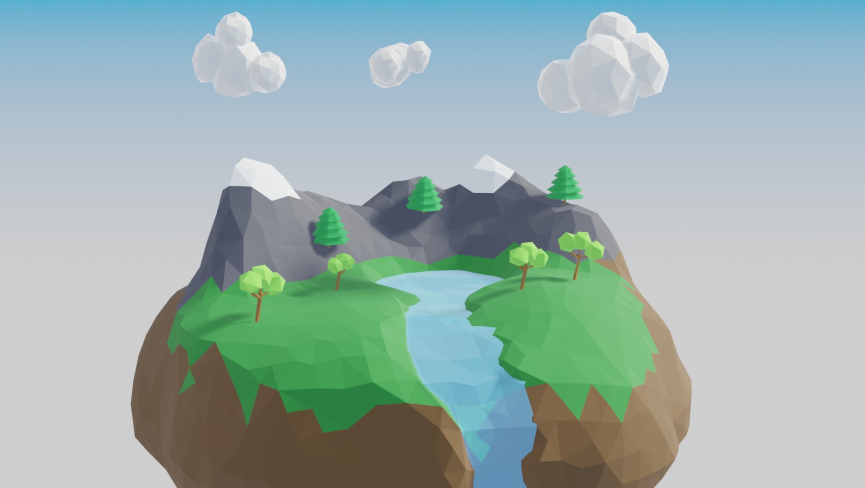
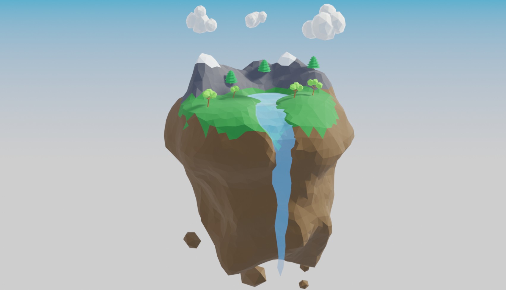
Today I’ve been working on my low-poly course again. This time the task was a floating island with a waterfall. I know I’m not the best artist, but I actually really like this one. I feel it has that calm, cartoon look that makes low-poly seem fun.
I think one of the biggest parts of making low-poly work is the attention to detail. Don’t get me wrong, I’m no expert and I have a lot to learn, but when working with so few polygons, you need little details to stand out and make the image pop.
In this case, I think its the mountain color. Several of my fellow course takers did a great job, and did many thing about their island better than I did, but one thing I noticed was that all of them had the same color for the mountains as the ground. So, a simple swath of cartoony paint seems to really bring the model to life. Or at least, that’s my hope.
In this class we actually sculpted the shapes instead of extruding or transforming a regular shape, so that was pretty neat to learn. We also used the pair tools as opposed to our normal materials color methods. I’m really learning a lot with this course, which is really great!
Linux – keep it simple.


I am enjoying your articles about Android and programming. I am here to learn more better to improve my programming skills.